18 Digits is a mission-driven apparel brand that creates high-quality, comfortable gear for both humans and their pets. Named for the 18 digits of paws they can't get enough of, the company operates on a simple but powerful premise: every piece sold sends real support to shelters and rescues. The brand targets pet-loving consumers who want premium, stylish apparel that aligns with their values, positioning itself as more than just another apparel company: they're building a pack, a community, and a movement.
As a brand-new company, 18 Digits faced the fundamental challenge of establishing themselves in the crowded apparel market while authentically communicating their dual mission of style and social impact. They needed to differentiate themselves from typical charity-focused brands that often sacrifice style for cause, as well as from premium athletic wear brands that lack meaningful purpose. The challenge was creating a brand identity that could command premium pricing while genuinely connecting with pet lovers and conveying trustworthiness around their charitable mission. Additionally, the brand needed to work seamlessly across multiple applications—from clothing tags and embroidered apparel to digital platforms and pet accessories—requiring a logo and visual system that was both bold enough to stand out and simple enough to reproduce across various scales and mediums.
Our primary objective was to establish 18 Digits as the go-to brand for pet-loving consumers seeking high-quality gear that makes a meaningful impact. We aimed to create a brand identity that would feel premium but approachable, taking visual and tonal cues from successful athletic wear brands like Lululemon and Athleta while maintaining a distinct personality rooted in community and purpose. The brand needed to communicate confidence and quality while fostering a sense of belonging among pet owners. From a practical standpoint, we needed to develop a flexible visual system that could work across apparel, accessories, digital platforms, and promotional materials, ensuring the brand would be instantly recognizable whether embroidered on a hoodie or displayed on a website.
Our comprehensive brand development process began with an intensive discovery and market research phase, diving deep into the pet apparel landscape, athletic wear market, and charitable giving space. This research revealed a significant opportunity: while premium athletic brands excelled at creating aspirational lifestyles, and charity-focused brands succeeded at tugging heartstrings, no brand was effectively combining both elements to create a genuine movement around pet love and social impact.
From a strategic standpoint, we positioned 18 Digits as the intersection of style and heart, developing three core messaging pillars that would guide all brand communications: "Bold & Built to Last" (emphasizing quality and durability), "People & Paws" (highlighting the community aspect), and "Every Digit Makes a Difference" (reinforcing the impact of each purchase). These pillars informed every aspect of the brand development, from visual design to tone of voice.
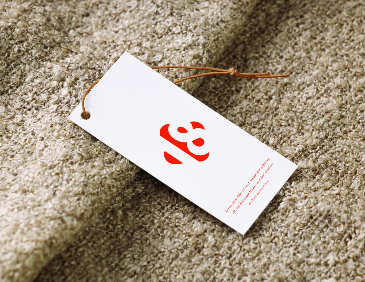
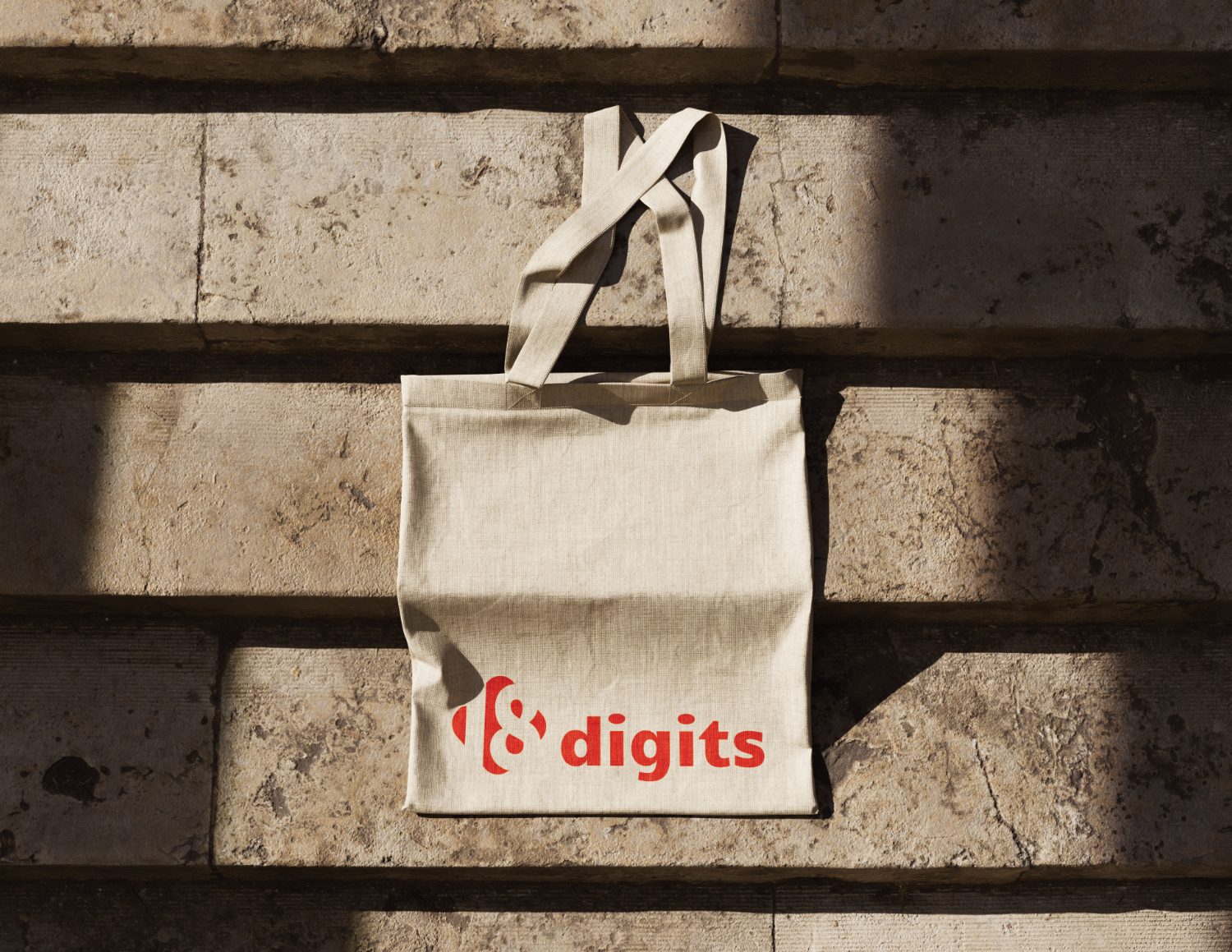
For the visual identity, we began with extensive sketching, exploring various concepts that could capture both the premium athletic aesthetic and the pet-loving spirit. The chosen logo design cleverly incorporated the brand name "18 digits" with a dog tag-inspired symbol, creating an instantly recognizable mark that worked beautifully across applications. The dog tag element was particularly strategic: it's universally understood by pet owners while feeling modern and sleek enough for premium apparel.
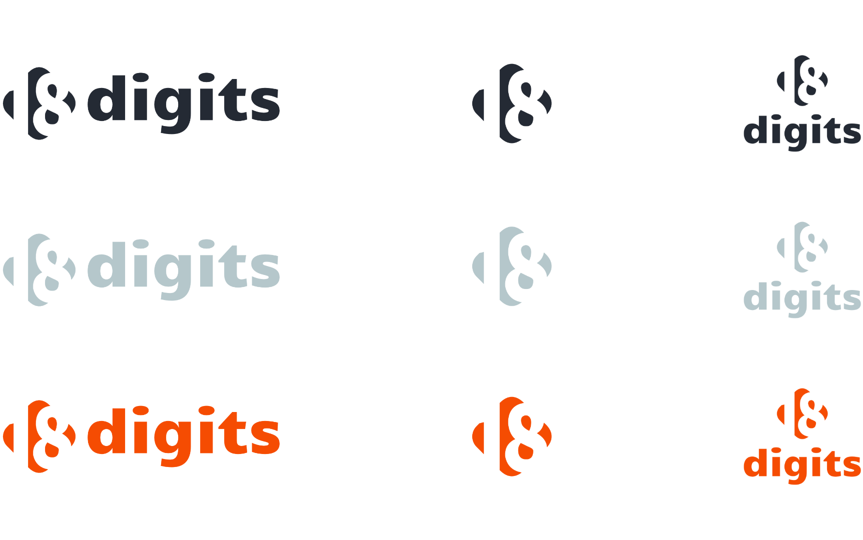
Our color palette development focused on creating a bold, confident foundation that could work across both human and pet products. We anchored the palette in Midnight, a sophisticated near-black that conveys premium quality and modern edge. This was balanced with Cloud, a soft blue-gray that adds approachability and calm, and clean White for balance and versatility. Sunset, a beautiful orange-red, serves as the accent color, bold enough to grab attention but used sparingly to maintain sophistication.
Typography choices reinforced the brand's dual personality of approachable luxury. Candal, a confident display font, handles headlines and attention-grabbing moments with impact and personality, while Raleway provides clean, readable body text that feels modern and trustworthy. This combination ensures the brand can speak boldly when needed while maintaining clarity and accessibility across all touchpoints.
Beyond the core identity, we developed a comprehensive icon library featuring stylized representations of dogs, cats, coffee cups, pet bowls, tennis balls, fire hydrants, and other lifestyle elements. These icons extend the brand's visual language across applications while maintaining the simple, modern aesthetic that works whether embroidered on apparel or used in digital applications.
The verbal identity development was equally strategic, crafting a tone of voice that's casual yet bold, community-focused yet purposeful. We developed messaging that avoids corporate speak in favor of authentic connection—"Snag this gear" over "Purchase our products," "Join the pack" over "Become a customer." This approach extends to the tagline "Gear Up. Give Back," which captures the brand's dual mission in four punchy words.
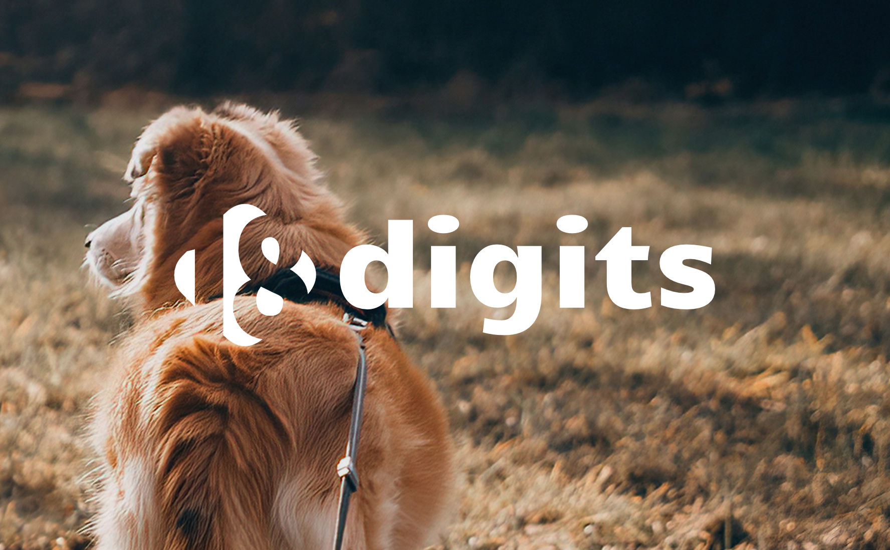
Throughout the process, we ensured every element could seamlessly translate across the brand's diverse touchpoints. The logo works equally well embroidered on a dog bandana or displayed on a website header. The color palette translates beautifully from screen to fabric. The messaging feels authentic whether used in social media posts or product descriptions. This comprehensive approach ensures 18 Digits has a brand system that can grow with them as they expand their product line and reach new audiences, always maintaining the perfect balance of style, purpose, and heart that makes them truly unique in the market.