Holistic Hype Woman, led by Brittany Benson, is a holistic life coach who guides clients through transformative journeys of self-discovery and intentional growth. Her practice encompasses two distinct coaching methodologies: Awareness Coaching, which helps clients understand and address deep behavioral patterns, and Intentionality Coaching, which transforms awareness into actionable steps toward specific goals. Beyond coaching, she offers tarot card readings and curates holistic tea baths, creating a comprehensive wellness ecosystem for her clients.
After several years in business, Holistic Hype Woman faced a critical brand alignment issue. Her existing visual identity had become a barrier rather than a bridge to her ideal clients. The brand felt loud, childish, and fundamentally disconnected from both her evolved service offerings and her target audience's expectations. This misalignment was particularly problematic for a holistic wellness practice, where trust and authenticity are paramount. The visual disconnect was undermining her credibility and failing to communicate the depth and maturity of her coaching approach, creating a gap between her brand perception and her actual expertise.
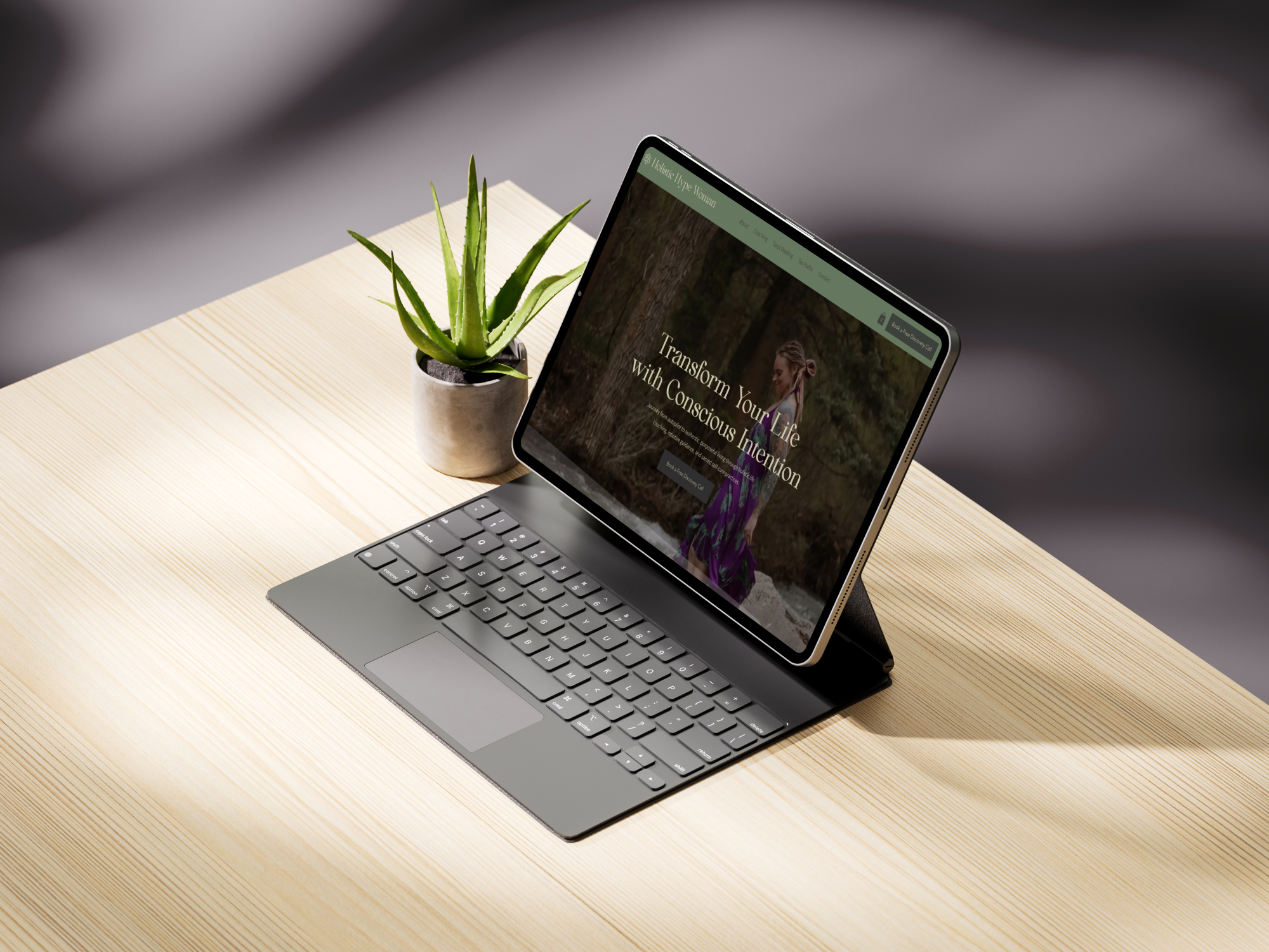
Our primary objective was to create a brand identity that authentically represented Holistic Hype Woman's evolved practice while resonating with her ideal client base. We aimed to develop a visual and verbal identity that felt mature, grounded, and deeply connected to the holistic wellness philosophy she embodied. The rebrand needed to communicate sophistication without losing approachability, and establish credibility while maintaining the warmth essential to her coaching practice. Additionally, the new brand system needed to effectively encompass her diverse offerings, including coaching, tarot readings, and holistic wellness products, under a cohesive umbrella that felt intentional rather than scattered.
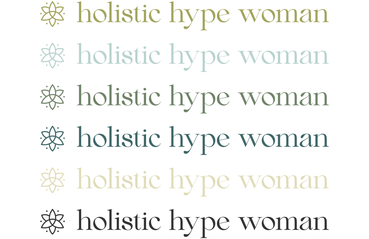
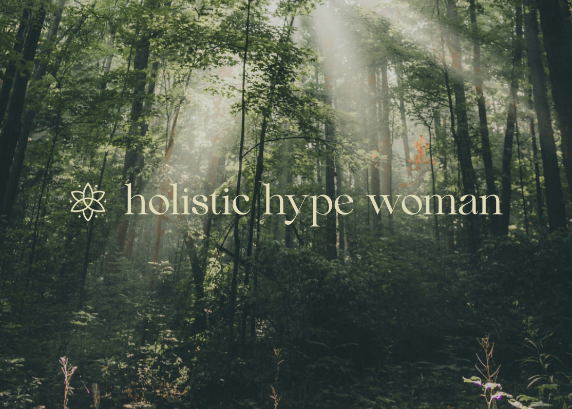
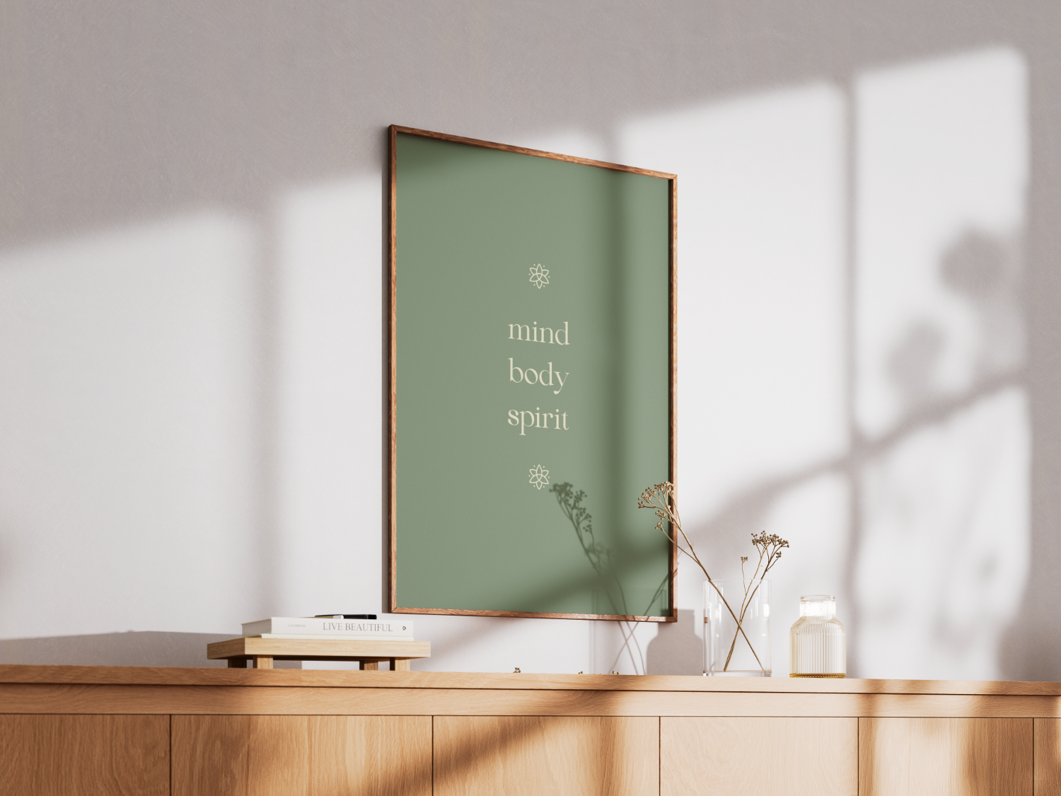
Our approach centered on the foundational concept of holistic alignment—the integration of mind, body, and soul that defines authentic wellness practice. We began by developing a logo that visually represented this interconnectedness, creating a symbol that communicated both the complexity and harmony of holistic healing. The mark serves as a visual metaphor for the transformation clients experience through her guidance.
We expanded this concept through a comprehensive icon library that touches on each aspect of her practice. These icons create visual consistency across all touchpoints while allowing for the distinct representation of her diverse offerings. This system ensures that whether clients encounter her brand through coaching materials or product packaging, they experience the same grounded, intentional energy.
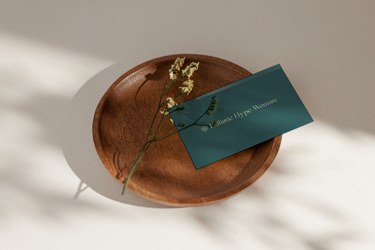
Our color palette strategy drew inspiration directly from nature, selecting hues that evoke the calming, rooted feeling essential to wellness work. The primary palette features a sophisticated moss green that serves as the foundational background color, paired with a warm cream for optimal readability and contrast. We incorporated four carefully chosen accent or additional colors to be used sparingly for visual interest while maintaining the overall sense of calm and groundedness.
Typography played a crucial role in establishing the mature, credible tone the brand required. We selected Beautiful Comethrue for headings and key messaging, a typeface that commands attention while maintaining elegance. For body text and secondary headings, we chose Assistant, ensuring optimal readability across all applications while supporting the overall brand personality.
Beyond visual elements, we developed comprehensive messaging and tone of voice guidelines that aligned with her authentic values and spoke directly to her ideal clients. This verbal identity work ensured that every written touchpoint—from website copy to social media posts—reinforced the mature, grounded positioning the visual identity established.

The rebrand received outstanding feedback from both the client and her existing community, validating our strategic approach to authentic brand alignment. The new identity successfully bridges the gap between Holistic Hype Woman's internal evolution and external presentation, creating a cohesive brand experience that supports her business growth while honoring her authentic self. The comprehensive brand system now provides a solid foundation for all future marketing efforts, ensuring consistency and credibility across every client touchpoint.