Move With Brandy is owned by Brandy Rheinschmidt, a real estate professional operating in Charlotte, North Carolina. Rather than positioning herself as just another realtor, Brandy serves as a trusted guide through life's biggest investments, leveraging her expertise as a local market specialist. Her business focuses on providing personalized, high-touch service to clients seeking properties in the greater Charlotte area, with aspirations to attract a more sophisticated clientele aligned with her evolving business goals.
Brandy's existing brand identity had been in place for years and no longer reflected her business's current trajectory or future aspirations. The previous branding skewed very bright and felt almost immature, creating a disconnect between her professional capabilities and visual representation. This misalignment was particularly problematic as Brandy sought to attract a higher caliber of clientele who expected sophistication and luxury in their real estate experience. The outdated branding failed to communicate her expertise, trustworthiness, and the premium service level she provides, ultimately limiting her ability to connect with her ideal target market.
The primary objective was to create a visual identity that authentically represented both Brandy's personality and her business's elevated positioning. The new brand needed to communicate sophistication while maintaining approachability, conveying luxury without appearing pretentious. Specific goals included developing a brand that would attract Brandy's ideal clientele, establish immediate trust and credibility, differentiate her from competitors in the crowded Charlotte real estate market, and create a cohesive visual system that could be applied across all marketing materials and touchpoints.
Origin Studio's approach began with an in-depth discovery phase designed to understand both the business fundamentals and Brandy's personal brand vision. This comprehensive research phase explored her target market, competitive landscape, business goals, and personal style preferences. Following discovery, the team moved into an extensive concept development phase, presenting numerous design directions to allow Brandy to provide detailed feedback and identify elements that resonated with her vision. This collaborative process ensured the final direction truly reflected her needs and preferences.
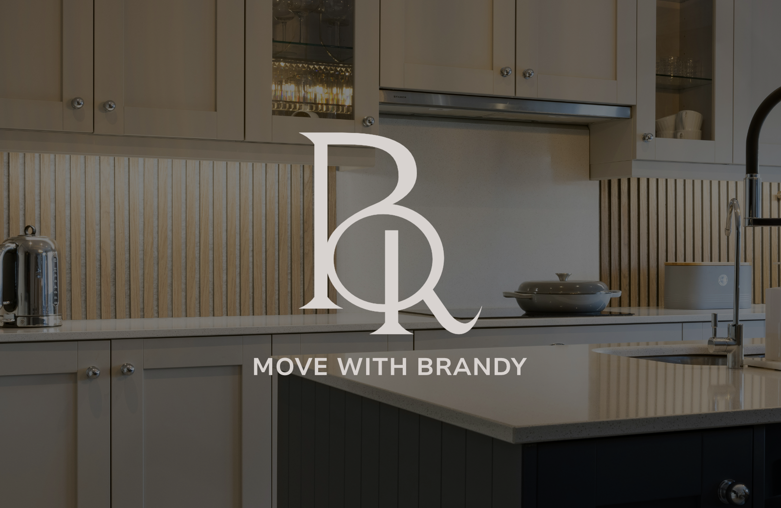
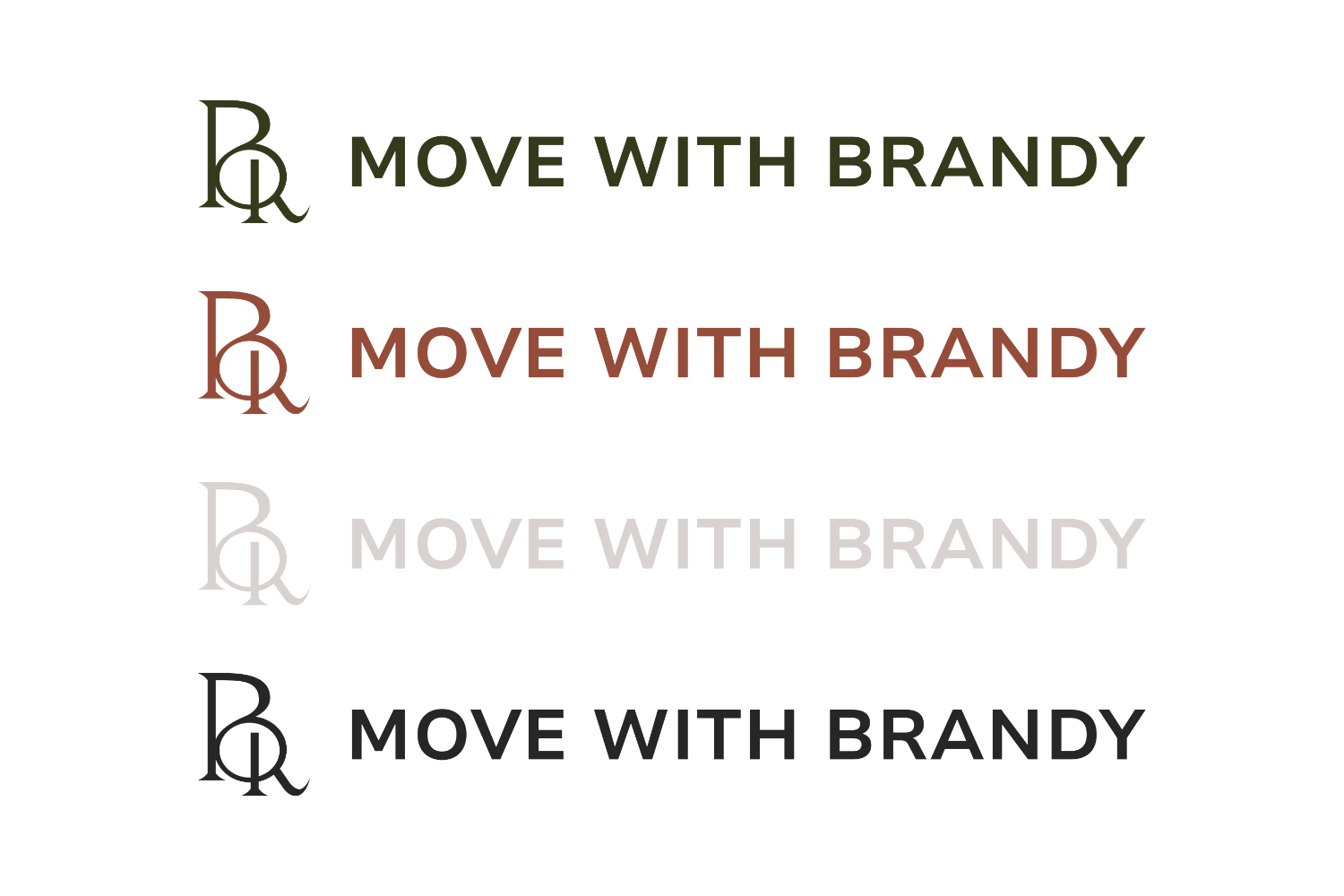
The visual strategy centered on creating a brand identity grounded in luxury with a modern edge. The team selected rich earth tones that convey elegance while maintaining warmth and approachability. The final brand achieves the delicate balance of being sophisticated yet trustworthy, calming yet charming, and professional while remaining personal. Typography selection focused on Nunito Sans, with bold weights for headings and regular weights for body text, providing clean readability with contemporary appeal.
The color palette was strategically developed around five core colors: Slate for sophistication and grounding, Clay for warmth and luxury, Sand for elegance and balance, Forest for trust and stability, and White for clean contrast and modern appeal. This earth-toned palette creates the desired hint of elegance while remaining versatile across various applications.
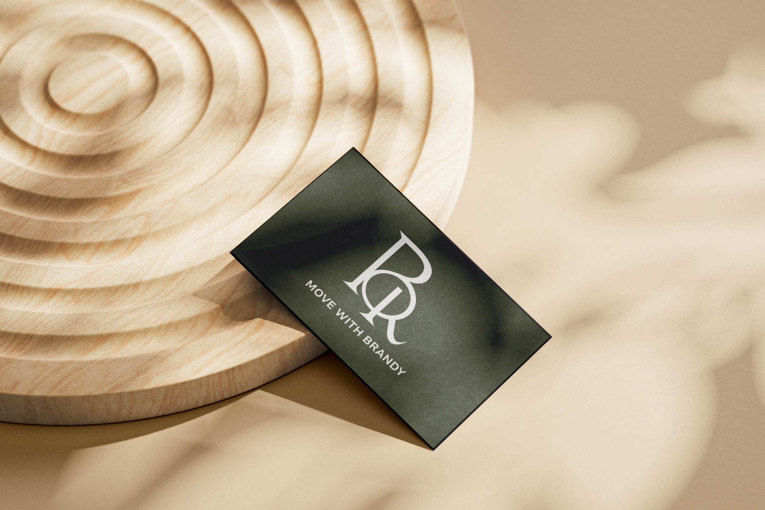
The comprehensive rebrand included multiple logo variations to ensure flexibility across different use cases, from primary and secondary logo options to an initials-only version for smaller applications. A custom icon library was developed to maintain brand consistency across all marketing materials and digital touchpoints, ensuring every visual element reinforced the sophisticated, trustworthy brand personality.
The deliverables package included complete brand guidelines documenting proper logo usage, color specifications, typography guidelines, and the custom icon library, providing Brandy with all the tools necessary to maintain brand consistency as her business continues to grow.